
Goals Redesign
Rebuilding trust in a product customers had learned to avoid.
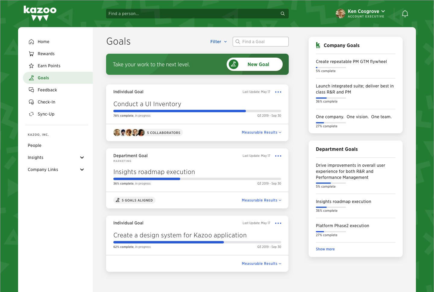
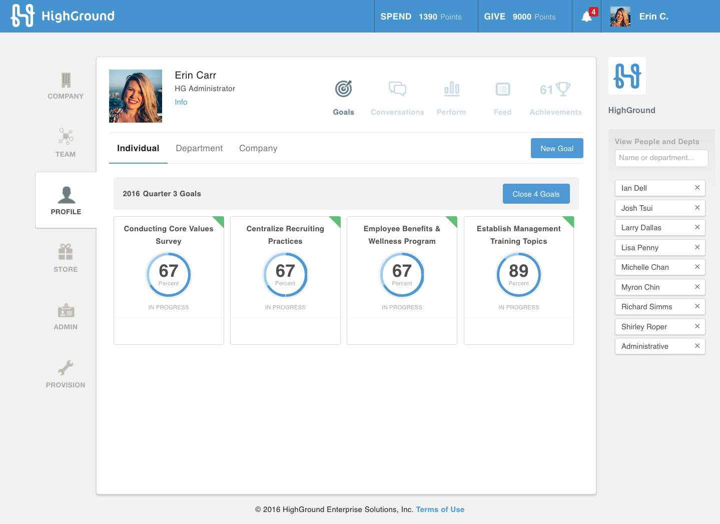
Goals was the OKR module inside Kazoo’s performance-management suite. It had originated in the earlier HighGround platform before the company had a dedicated product-design practice, and years of accumulated decisions had left it with confusing navigation, weak hierarchy, redundant screens, and too many clicks for routine work. The experience frustrated customers and had become a weak point in sales conversations.
I co-led customer research, synthesized usability tests into design direction, and owned the final interface across desktop and mobile. I also managed a UI/UX intern through portions of the work and partnered closely with product and engineering as the redesign moved toward delivery.
Starting with the most frustrated customers.
The broad problems were already visible, so we focused discovery on the moments that carried the most friction: finding a Goal, creating one, reviewing its details, and updating progress. We brought early concepts directly to dissatisfied customers, then iterated through interviews and A/B tests instead of treating internal agreement as validation.
The work also had to serve more than individual contributors. Managers and administrators needed organization-level visibility, metrics, and permissions without making the everyday experience feel like an admin tool. That tension shaped the new hierarchy: personal work stayed central while department and company Goals remained visible and easy to reach.
Improving the experience without rebuilding the machinery beneath it.
The central constraint was technical, not visual. Goals depended on fragile backend functionality that stakeholders considered effectively fixed. We could not start over or remove the underlying mechanisms, even when the interface made their complexity obvious.
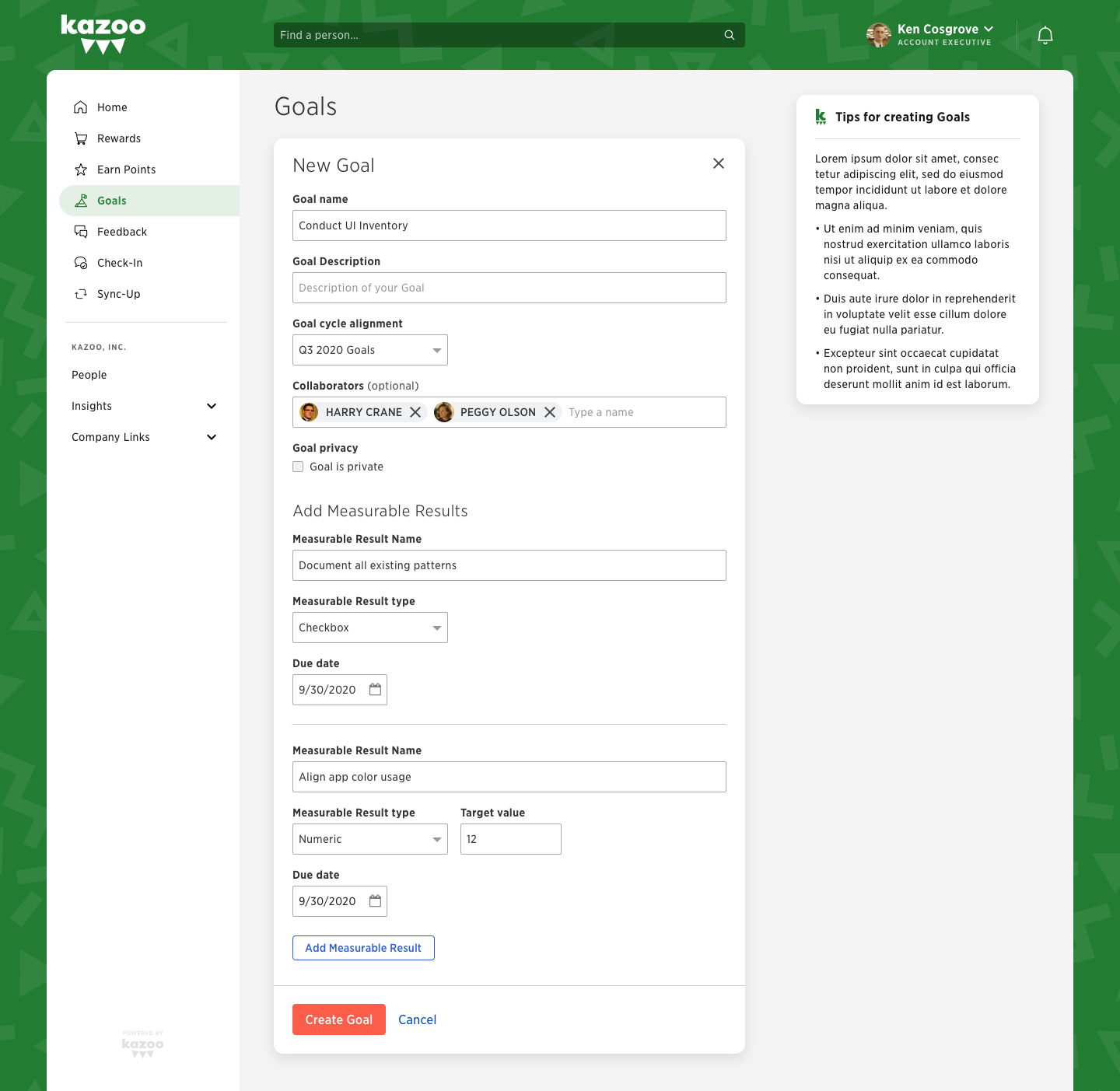
I worked closely with engineering to find improvements the existing system could support. We consolidated steps, clarified relationships between fields, exposed guidance where it was needed, and reduced the amount of clicking in and out of separate screens. The redesign made the product feel substantially simpler while remaining realistic to build.
Designing desktop and mobile as one product.
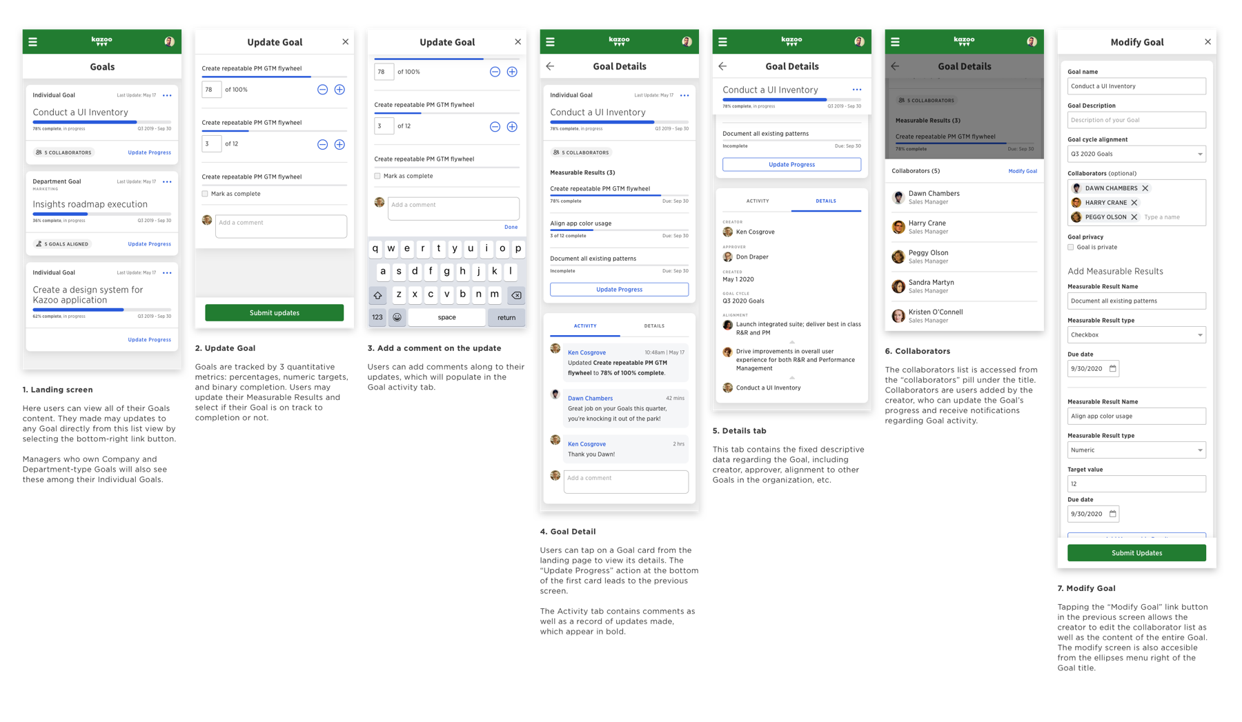
Mobile was designed alongside the web experience, not adapted after it. We tested the two versions independently so the interaction model could respond to different screen sizes and established mobile patterns while preserving the same structure and capabilities.
The smaller screen forced us to be explicit about priority. Common actions moved into focused panels, key progress information stayed visible, and the Goal detail view unfolded in a logical sequence rather than reproducing the desktop layout at a reduced scale.
Turning the detail page into a place to work.
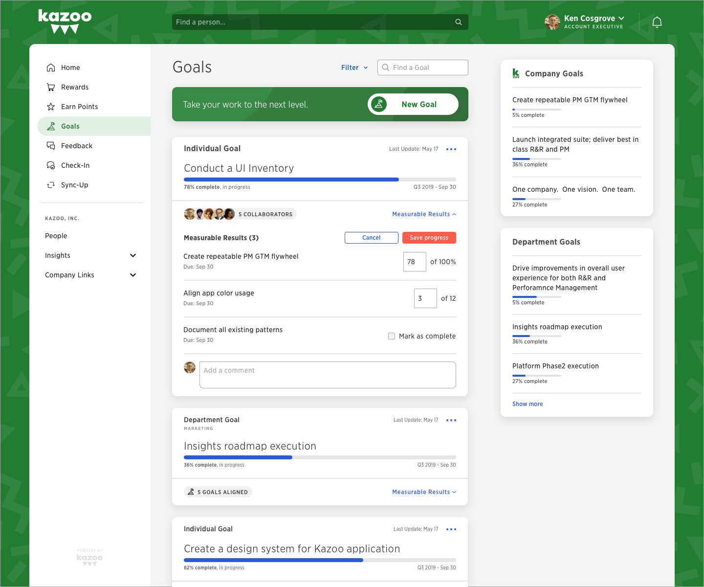
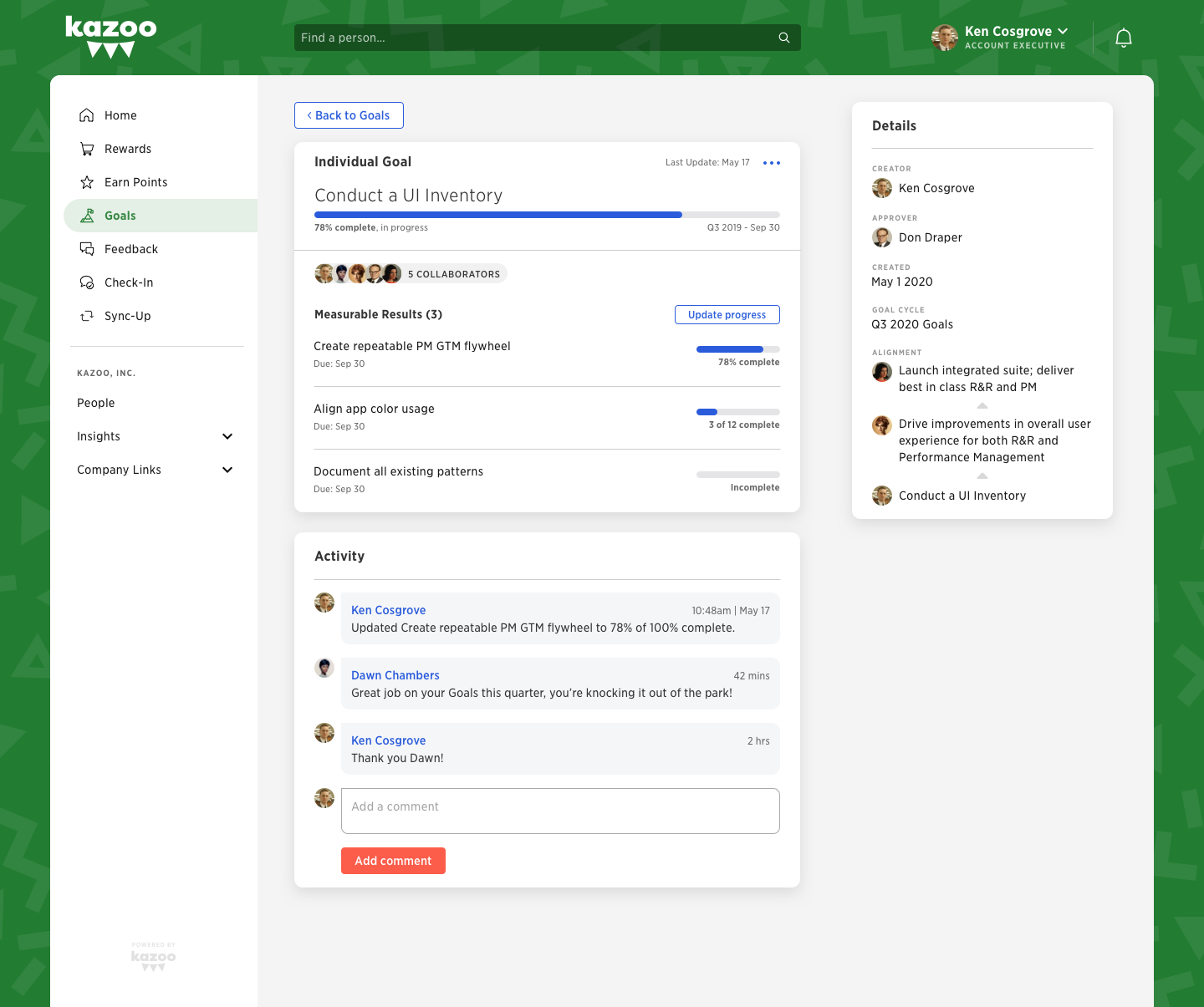
The redesigned detail view brought the Goal’s status, measurable results, collaborators, activity, and ownership into one clear surface. People could understand progress at a glance, update results, and discuss the work without bouncing among disconnected pages.
This was the larger design move across the product: use space to reveal context and action together, then let people drill deeper only when the task required it. Full-width cards and a stronger hierarchy made the experience more useful immediately and more scalable as Goals became more complex.
The outcome.
The redesign turned a persistent customer complaint into a stronger product story for customer success, retention, and sales. More importantly, the behavioral results showed that the new experience changed how people used Goals—not just how they felt about its interface.
- 50%
- fewer clicks across Goal tasks
- 53%
- increase in Goal creation in the first quarter
- 37%
- average increase in product usage across three quarters
“This is the best thing you have ever done for us.”
Previously dissatisfied customer