
SP Mobile Design System
Creating the foundation for a new AI product—in parallel with the product itself.
SurePeople was replacing a legacy desktop platform with a premium, mobile-first experience built around Prism, its proprietary personality assessment. An outside agency had established the initial visual direction for the assessment flow, but the internal team still needed a system capable of supporting an entire product. I was hired to lead that work while two other designers were already building new modules against an aggressive launch schedule.
Rather than pause feature work to design a theoretical system in isolation, I treated the roadmap as the proving ground. I audited and reworked the agency patterns, anticipated shared needs across upcoming modules, and evolved the library alongside the product. This gave the team useful standards immediately while keeping the system grounded in real interface problems.
Encoding consistency into the team’s workflow.
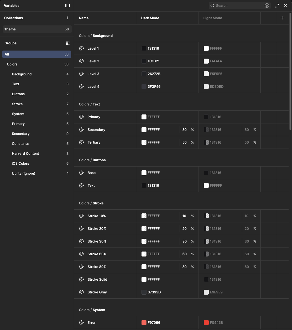
I established the practical rules behind color, typography, spacing, strokes, surfaces, and light and dark themes, then encoded them as reusable variables and styles in Figma. A change at the system level could cascade across every connected product file instead of being corrected screen by screen.
That infrastructure changed how the team worked. The other designers—both new to design systems—could compose production-ready screens with shared decisions already built in, while I guided adoption, documented usage, and created new patterns as feature work exposed new needs.
Designing for behavior and edge cases—not just the happy path.
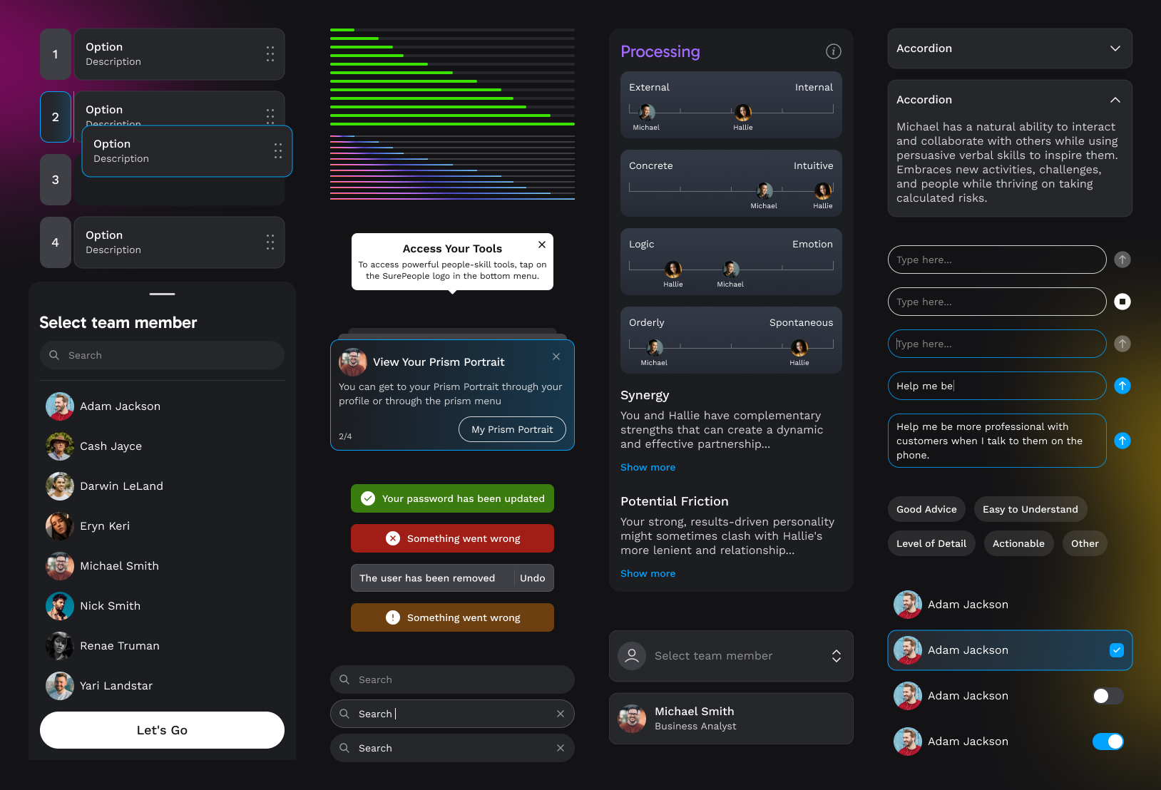
I built components around how the product actually behaved: variants, nested properties, interaction states, content flexibility, and edge cases across coaching, assessment, profile, and team experiences. Designers could move directly into high-fidelity composition—using the system itself as a rapid wireframing tool—without creating a new visual solution for every flow.
I remained the system’s sole owner throughout the build, making visual and behavioral decisions in real time and balancing reuse with the moments that genuinely required a new pattern. The result was a library that accelerated production without flattening the product into generic UI.
Using motion to close the gap between intent and implementation.
Static screens could not fully communicate the level of polish expected from the product. I extended the system into motion and interaction guidance, prototyping key behaviors in Figma and creating detailed animated references in After Effects—including for modules designed by other team members.
Reviewing the product in motion helped us catch awkward transitions and refine small interaction decisions before they became engineering rework. Because developers joined our design critiques, these prototypes also became a shared implementation contract for timing, hierarchy, and feel—not merely presentation artifacts.
Building coherence into the details users see everywhere.
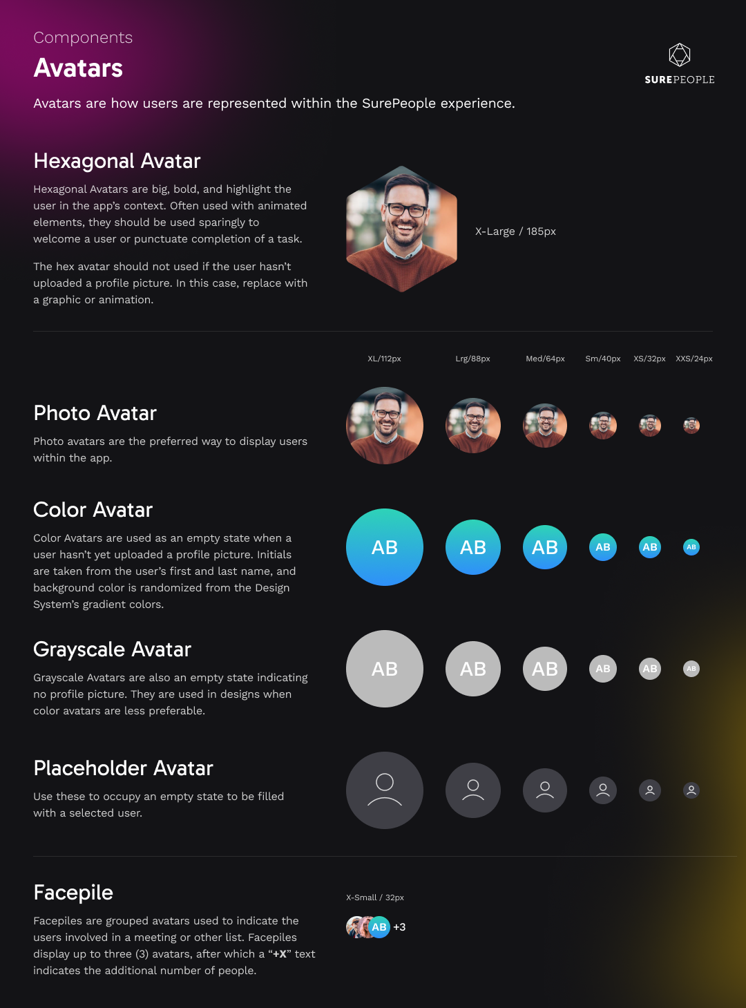
The avatar family is one example of the depth required to make the system durable. I accounted for photography, generated identities, grayscale states, missing data, placeholders, and compact team groupings. These were small elements individually, but they appeared throughout a product centered on people and relationships—making them foundational to clarity and brand consistency.
The outcome.
Over my six-month engagement, the system became the shared foundation for the new SurePeople mobile experience. It increased design velocity, enabled instant cross-file updates, helped three designers work as one team, and gave engineering a clear path from approved design to production. As the app moved into production, the interface remained coherent across a rapidly expanding set of AI coaching and team-intelligence features—without trading away the interaction quality that made the product feel premium.